Theme Style Customization Guide
The Theme Style feature in BizCore allows administrators to customize the look and feel of both the admin and customer areas. By adjusting colors and styles, your company can ensure consistent branding, improve readability, and create an aesthetically pleasing user interface. All settings use hex codes for precise color control.
This guide provides detailed instructions on how to configure each theme component.
Accessing Theme Style
1. Log in to BizCore
Use your administrator credentials to access the system.
2. Navigate to Setup
From the sidebar, click Setup.
3. Open Theme Style
Under Setup, click Theme Style.
You will see several customization sections: Admin Area, Customer Area, Buttons, Modals, Tables, General, and Custom CSS.
Theme Style Sections
1. Admin Area
Customize the appearance of the administrator interface for better usability.
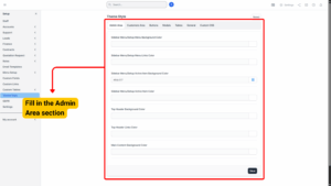
| Field | Description |
|---|---|
| Sidebar Menu / Setup Menu Background Color | Sets the background color of the sidebar and setup menu. |
| Sidebar Menu / Setup Menu Links Color | Sets the color of menu links in the sidebar. |
| Sidebar Menu / Setup Active Item Background Color | Sets the background color for the currently active menu item. |
| Sidebar Menu / Setup Active Item Color | Sets the text color of the active menu item. |
| Top Header Background Color | Sets the background color of the top header bar. |
| Top Header Links Color | Sets the color of links in the top header. |
| Main Content Background Color | Sets the background color of the main content area. |
2. Customer Area
Customize the interface your customers interact with.
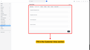
| Field | Description |
|---|---|
| Navigation Background Color | Sets the background color of the navigation bar. |
| Navigation Links Color | Sets the color of navigation links. |
| Footer Background Color | Sets the background color of the footer. |
| Footer Text Color | Sets the color of text in the footer. |
3. Buttons
Customize the colors for different types of buttons across the system.
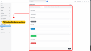
| Button Type | Description |
|---|---|
| Button Default | Standard button color used throughout the system. |
| Button Primary | Primary action button color. |
| Button Info | Used for informational actions. |
| Button Success | Indicates successful actions or positive outcomes. |
| Button Danger | Used for destructive or warning actions (e.g., delete). |
4. Modals
Customize the appearance of pop-up modals.
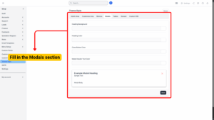
| Field | Description |
|---|---|
| Heading Background | Sets the background color of the modal header. |
| Heading Color | Sets the text color of the modal heading. |
| Close Button Color | Sets the color of the modal’s close button (X). |
| Modal Header Text Color | Sets the color of any text inside the modal header. |
5. Tables
Customize table appearance for clarity and better visual organization.
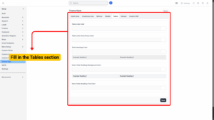
| Field | Description |
|---|---|
| Table Links Color | Sets the color of clickable links in tables. |
| Table Links Hover/Focus Color | Sets the color of table links when hovered over or focused. |
| Table Headings Color | Sets the text color for table headings. |
| Items Table Headings Background Color | Sets the background color of table headers in item listings. |
| Items Table Headings Text Color | Sets the text color of item table headers. |
6. General
Customize default system-wide styles for links and text.
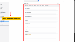
| Field | Description |
|---|---|
| Links Color (href) | Default color for hyperlinks. |
| Links Hover/Focus Color | Color of hyperlinks when hovered or focused. |
| Admin Login Background | Background color for the admin login page. |
| Text Muted | Color for secondary or muted text. |
| Text Danger | Color for danger or error messages. |
| Text Warning | Color for warning messages. |
| Text Info | Color for informational messages. |
| Text Success | Color for success messages. |
7. Custom CSS
– Allows advanced users to apply custom CSS styles.
– You can target Admin Area, Customer Area, or both separately.
– Use this section for fine-tuned visual adjustments that are not available in the standard color settings.
Applying Changes
1. After adjusting colors for all desired sections, click Save.
2. Ensure all hex codes are valid (e.g., #FFFFFF for white, #000000 for black).
3. Refresh your system pages to see the changes take effect.